Lesson #6: Successful accessorizing: Tell customers about winning strategies they can use to show-off furnishings and “wow” their friends.
Editor’s note: This is the sixth article in our Decorating Crash Course series. The text is written so that you can easily use it to conduct a customer seminar on successful accessorizing. It can be presented “as is” but you should add additional elements to give your seminars a personal touch as outlined in the December/January 2007 issue of FURNITURE WORLD Magazine, “Simple but Sensational Seminars: Keys to a Memorable Presentation,” posted to the article archives on www.furninfo.com. Decorating seminars are a fantastic way to get quality leads and referrals. They help customers to solve decorating problems, and they position you as a home furnishings expert.
Quotation marks only appear at the very beginning and end of the “sample seminar script” for ease of presentation.
“The only thing that separates us from the animals is our ability to accessorize.” - Robert Harling
SAMPLE SCRIPT: SUCCESSFUL ACCESSORIZING
“Humans have an innate desire to accessorize the things that touch our lives. We decorate our food, our bodies, our land, and our wardrobes with accessories of every color and texture imaginable. And our homes are no exception. Most homeowners look for opportunities to embellish the home and bring it beyond the functional and into the arena of the beautiful. Home accessorizing is the way we accomplish this.
Accessories are the jewelry of an interior. They can add accent and emphasis to your living spaces, and they also serve to pull your entire design together. There is a certain art to placing accessories in the home, but more inspiring than that, there are some basic principles of home accessorizing that if followed, will help lead you to successfully designed interiors. If they are handled well, accessories can make a space come alive by adding interest, texture, shape and color to a room design. If overdone with accessories, your space can seem cluttered, un-harmonious, and without natural flow.
Identify & Accessorize Your Focal Point
The very start of accessorizing a room or space begins with identifying your focal point, which will be the main furniture piece (or built-in structure) most likely placed on the DOMINANT wall (the wall you notice most or first when entering a room).
Good accessorizing stems from playing up the focal point, and then continues throughout the room. Play up the focal point, and dress it up to create the room’s main emphasis point. For example, if the focal point is a mantle, celebrate it with a grand display of matching vases and floral arrangements on either side of a tall and wide elaborately framed print. If it is a bed or sofa, dress it with beautiful custom throw pillows with loop or brush fringe and a glamorous throw. If it is a large window, dress with European pleated panels edged in tassel fringe, or with a treatment that supports the style of the space and is tasteful and beautiful. Flank a focal point such as a hutch or fireplace with artwork, vases, or accent chairs to enlarge the area, and dress the shelves with unusual interesting glassware, pottery, or collectibles in various textures and sizes with “pops” of color.
Situate Area Rugs Define the Space and Add “Punch”
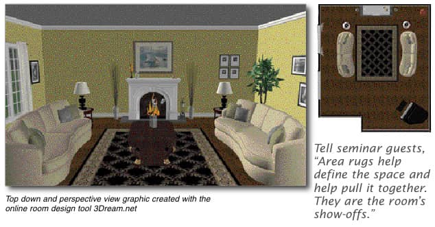
After establishing and dressing the focal point, it can be very helpful to give the main activity areas of a space some boundaries. Area rugs help define the space and help pull it together. Area rugs are the room’s “show-offs”. Although they are actually in the category of flooring, area rugs also act as accessories since they embellish an area with color, texture, and pattern. Best of all, they are easy to move and manipulate and easy to shop for and install. Area rugs provide you with an exceptional opportunity to add design, mood, pattern, texture, warmth, and a great pop of color to a room or to a specific area, and they can be used in large or multi-purpose rooms to break up the space and define individual seating groupings. Area rugs can also help establish a style or theme that other accessories can support. To add extra excitement to your design when working with an area rug, try angling it for a lively feeling. You will be amazed at how this can open up a room. Angling the rug works particularly well when the sofa is also angled.

The Basic Principles of Room Accessorizing
1. Simple is Best: Once your focal point is in place and dressed, and your area rugs are situated, you can begin adding other accents. In creating displays, remember that simple is best. Don’t clutter up any of the walls, tables, or the empty areas with stuff. Be purposeful in your use of accessories. Use them with design techniques to add color, height, interest, or emphasis to a particular spot. Always remember to use scale, weight, and proportion. Objects should be balanced and in line with one another and with the other elements of the room. Visual symmetry can work when you do not have matching objects needed for perfectly symmetrical displays. As long as the visual space taken up by two displays are about the same, the effect can work like perfect symmetry to give a feeling of balance.
2. Wide with Wide, Narrow with Narrow, Tall with Tall: Always match wide spaces with wide accessories, narrow spaces with narrow accessories, and tall spaces with tall accessories or accessories layered for height. For example, when dressing a wide wall area, use wide framed art, or when dressing a tall, narrow space on the side of a china cabinet, use a tall and narrow vase and floral arrangement. Place a large wooden box, a tall basket, or a plant on a table for added height. Fill up the space you are accessorizing, but leave “breathing room” around the items so the area does not seem cluttered, and the eye and mind have time and space to process the design peacefully.
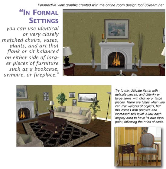
3. Be Mindful of Scale: Chunky with Chunky, Delicate with Delicate: Scale is also important. Try to mix delicate items with delicate pieces, and chunky or large items with chunky or large pieces. For instance, a pair of delicate candle holders would be a better accessory choice on a dainty coffee table with delicate legs than would a pair of rugged and thick candle holders. There are times when you can mix weights of objects, but this comes with practice and increased skill level. Allow each display area to have its own focal point, following the rules of scale. A big chunky accent table would have a chunky decorative box or lamp, for example. You can then add other items of different sizes for interest once you have your display area focal point in place.

4. Add Variety in the Elements: Use a variety of textures, shapes, colors, and sizes for wall displays, and for tabletop displays use these elements plus elements with varying heights. Try to mix fabric pieces and upholstered furnishings with hard surfaces such as woods, stone, and metals to add beauty and enhance a space.
Contrasting shapes and lines can be used to add visual interest. Mix some horizontal lines in with vertical lines, and use a few round shapes to balance an abundance of right angles and square shapes in a space.
5. Handle Groupings with Simplicity: One of the best things you can do to make your home look beautiful and feel restful is to avoid using too many knick-knacks and accessories. Because home fashion accessories are small, relatively inexpensive, and plentiful, it is very easy to gather far too many of these home jewels. Keep it simple, and use only the accessories that you and your family really love, and those that are meaningful in some way.
Another key for good design is to group like items together. Never spread a collection out all over a room. Create placements where a few attractive items are situated near each other in small clusters of no more than 3 or 4 items. Generally speaking, groups of accessories should not typically be displayed in even numbers, at even heights, or evenly spaced apart unless the setting is contemporary in style, or unless the style is strict in formality. Vary heights, shapes, sizes, and placement for added dimension. Odd numbers create interest, and groups of three work particularly well when placing accessories on shelves, tables, and case goods.
Let’s consider a setting on a mantle shelf as an example. Suppose you had a large, chunky framed piece of art on the wall centered over the mantle. On one side of the shelf you might have a husky pottery vase or jar, and on the other, a collection of two or three smaller items that TOGETHER are roughly balanced in visual weight. For added texture and interest, you could set these accessories on a thick, textured fabric runner or mantle scarf.
Pairs can be effective for adding interest, particularly in FORMAL settings where perfect symmetry is a key component. Those of you who attended our last two seminars on styles and furniture placement will be familiar with this concept. So, in formal settings you can use identical or very closely matched chairs, vases, plants, and art that flank each other or sit balanced on either side of larger pieces of furniture such as a bookcase, armoire, or a fireplace.

6. Be Bold with Framed Art and Wall Art: Be bold with your wall pieces. Allow the size of framed art to “take up” the space it is occupying, and be in the center point of that space. If the wall space is wide, use a wide framed piece. Avoid putting tiny framed pieces on a big wall. This can look very awkward.
Avoid hanging artwork too high. This is a typical mistake that homeowners make. Also, watch that your framed pieces are not positioned too low. To keep an overall sense of balance and harmony in a space, start with the center of the piece at 5 feet up from the floor and make any necessary adjustments from that starting point.
You may need to raise or lower the piece in relation to the other furnishings. Just be aware that eye level and a bit above is a comfortable point at which to view art.
Give artwork a little “breathing room” on all sides. Artwork hung above furniture should take about 2/3 of the visual space above the furniture piece. However, for framed art in a grouping, try not to have too much space between frames. Pictures are normally placed about 4 or 6 inches apart. Use your flat hand as a guide with your fingers touching to see that there is ample space between pictures. The space between objects in your grouping should be this distance apart or less. You can use a 2” space for tighter groupings if needed, as long as the grouping seems uncluttered.
Use symmetrical placement on a wall for 2 very similar or near identical pieces. Create a mirror image for a formal look, or balance for a more traditional or casual look. When dealing with a variety of different sized pictures, go for balance rather than perfect symmetry. For two pictures of the same size, try hanging them side by side on a wide wall with one a few inches above the other, but don’t hang either of them too high.
For accessory displays on a wall, anchor the area with the visually heaviest piece at the bottom.

7. Greenery Basics: Plants bring the outdoors in and provide a calming effect. Even artificial plants can make a peaceful impact. Plants also help to clean the air and add a subtle and pleasing fragrance.
If you will be using real plants for accent indoors, consider two areas that could potentially cause problems.
- Plants can attract insects indoors.
- Plants can accumulate moisture or cause water damage.
Be aware of this, and make sure the floor or area where you place your plants will not be ruined from dirt and water. It is important that you are certain your containers will not leak, and that you do not over-water your plants that sit on surfaces such as wood, that can be ruined from water stains or water damage.
If using artificial plants, aim for quality leaves and stems that will not easily come apart. Make sure the plants look quite real. Purchase the best quality artificial plants that your budget will allow. Artificial plants that look authentic can serve to greatly beautify a space and provide a calming mood.
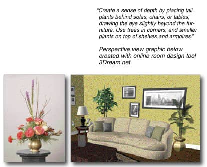
Create a sense of depth by placing tall plants behind sofas, chairs, or tables, drawing the eye slightly beyond the furniture. Use trees in corners, and smaller plants on top of shelves and armoires, and in little nooks and crannies that would otherwise seem bare or without texture. Use uplights to illuminate plants and throw their shadows towards the ceiling.
8. Fragrance Basics: Fragrance is one part of designing a space that can easily be overlooked, yet a fragrant room can add a great deal to the finished mood and effect. Fragrance will make a room more pleasing and inviting.
Some natural fragrances can be introduced through real plants. There are also a variety of synthetic fragrances that can have a wonderful effect on your space.
Candles are an excellent way to perfume the air, however, the flame can pose a fire hazard. An alternative to an open flame of a candle is the use of a candle warmer. You can set the candle on the warmer, allowing it to perfume the space.
Also consider such products as electric room fresheners, fragranced air filters, and oil lamps. There are certain products that burn scented oils and at the same time take the impurities from the air. When accessorizing a space, try to factor in fragrance and the many beautiful containers and lamps that can help you to gain a complete room design.
A Call to Action
By now you are probably inspired to clear some of the clutter from your displays, hang your art at the right height (not too high), and mix it up in terms of color, textures, lines, fabrics, and hard surfaces. The best time to take action is when your knowledge is fresh and motivating.
Set aside an hour or so to work on one area in your home that can use a new look in terms of the accessorizing. Perhaps you can start with a mantle shelf or even a side table in a living area. Begin to apply some of the principles you have just learned to that one small area. Take the next step and complete another area in that same room. Then, tackle moving just one or two of the framed wall pieces that seem to be hung at wrong heights.
Notice the transformation you experience from a few simpler changes. The room will not only look better, but it will feel more restful, too.
In time, as you accessorize different rooms and areas in your home, you will get better at the art and science of successful accessorizing. It is really a matter of practice and of following some basic principles that really work.
If you would like additional assistance or have questions, please feel free to speak with me or one of the other helpful design consultants at “XYZ Furniture Store”. We have a number of designers on staff who can help you work with your existing pieces or find the perfect furniture and accessories to make your living spaces both functional and beautiful.
Next issue: Lesson #7 – The Fabric of Our Lives: Pattern and Texture Choices that Wear Well and Feel Right.
Margarett DeGange, M.Ed. is a Business and Design Coach in the Home Fashions Industry. She creates and delivers custom training programs for managed businesses and their sales consultants to help them communicate better with customers and increase sales and profits. Margarett is a Writer and Professional Speaker, and the President of The DeGangi Group and The DeGangi School of Interior Decoration, with both on sight and on-line courses in Interior Decorating, Marketing, and Redesign. For almost 20 years she has helped individual and managed business owners in the interior fashions and decorating industries to earn more while fully enjoying the process.
Margarett’s new product, Let's Talk About... Decorating (www.letstalkaboutdecorating.com), features pre-packaged seminars for those who want to put on the customer presentations featured in this series of FURNITURE WORLD articles without going through the bother of additional preparation. Questions can be directed to Margarett DeGange at margarett@furninfo.com.