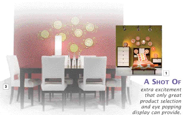
That extra shot of excitement that only great display can provide.
Furniture Trends by Janet Holt-Johnstone
At any of the Markets’ waterholes or coffee bars anywhere on the circuit from High Point to Las Vegas to Toronto to Milan to Taipei, you’ll hear retailers talking “competitive edge”. Never has it been a more vital quality to possess, nor more difficult to achieve.
They say that customers are bored, jaded. They’ve seen so much variety in shelter magazines and on television design shows that they’re saturated with superlatives. And they’re confused, too, many of them. Too many choices, some good, some bad. What are the trends, the stylings, the good stuff, they’re asking.
Another dilemma, once the customer defines her/his personal lifestyle direction, then buys sofas, chairs, tables, accents and accessories and takes delivery, more often than not the pieces are not properly placed in their homes for function nor aesthetic appeal.
With tough business conditions the rule for retailers in much of North America, home furnishings retailers need to find a way to keep customers engaged, interested and asking questions.
Quality and service are vital elements, as are techniques often described in FURNITURE WORLD for boosting traffic, closing percentages and average sale. Beyond these issues though, the shopping experience has to be fun. And the best retailers work to ensure that customers get a shot of extra excitement that only great product selection and eye popping display can provide.
Riding to the rescue of both retailer and consumer are top designers and presentation specialists, Pierre D’Anjou and Andre Caron, creators for the ninth consecutive year of the much heralded Trends Display. Visitors flock to the Canadian Home Furnishings Market in spite of the snow, sleet, hail and freezing rain of a northern January, to view and buy the introductions of more than 400 Canadian and international manufacturers and importers. But they also came to see Pierre and Andre’s latest offering.
They took a different tack this year, for the first time creating a “furniture gallery”. Fourteen displays, each having a different visual ambience were presented to offer retailers and their “needy” customers, inspiration to replicate on the showroom floor or at home. The Display conveyed the impression that one had just walked into a store. Vignettes were themed, well spaced, no clutter, appropriately accessorized with perfect accent lighting.
Each gallery presentation directed customers to other collections on display throughout the store.
“Visually, everything is much more open; we don’t block the view of other things,” said Pierre. The partners are well known for their imaginative use of unexpected accessory touches. Particularly interesting in these days of environmental consciousness is the opportunity to “recycle”.
In the first vignette, the arresting wall décor consists of a series of round metal shapes. “They’re ‘castaways’ from the production of industrial vacuums! I picked them up some months ago, was intrigued by their possibilities and kept them. I recycled! For the vignette, we painted them orange, then stuck vinyl tape on them in concentric circles. You’ve got to keep your eyes open!”
Pierre’s “castaways” reflect the pattern of the bold bed linens, which soften and enliven South Shore Furniture’s clean-line bedroom set. He fitted two of the “shapes” as bedside lamps, effective for the setting.
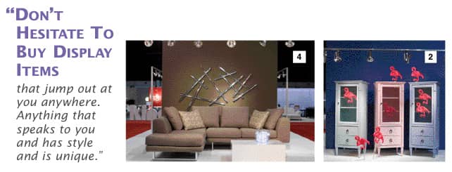
There wasn’t a visitor who didn’t smile when visiting the next “gallery” emplacement! There’s something about a gaggle of pink flamingoes on a cold winter day that tickles the fancy. And draws attention to A.P. Industries’ three identical sweater chests (#2), all in pastel shades. Pierre found the flamboyant birds at an outdoor store. “They’re a whimsical touch, inflatable, and actually intended to put around your tent when you’re camping!”
An unusual treatment for Bermex’s sophisticated dining room conversely enhances its formality. Try putting place settings on the wall rather than on the table! “The wall treatment is actually a collection of party plates that I got at a gift store. They’re made of plastic, you know, like model cars. Plates and egg cups and knives and forks and spoons, all assembled.” Colour used surprisingly (making trends as well as following them!) is another inexpensive way to create that “edge”, here green on warm fuschia.
Sophistication reigns again in vignette #4 with William’s elegant chrome-legged sectional sofa. Strong earth tones are made vibrant with the striking wall art, reflected by the vase on the low table. “Actually,” said Pierre, “it’s the other way ‘round! The metal-stick Italian vase was the inspiration. We went to Home Depot and bought inexpensive electric tubing and then, at a sign shop, sheets of chrome-coloured plastic with glue on the back.
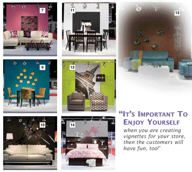
We wrapped the tubes with the plastic and, the night before Market, I allowed myself to be inspired and had the fun of creating the abstract design for the wall, sketched it first, then applied it to the wall. It’s important to enjoy yourself when you are creating vignettes for your store, then the customers will have fun, too!”
The fifth gallery “portrait” kicked off with dazzling snow cone green as its backdrop. It framed Vogel’s warm orange swivel chair, the circular patterned fabric offsetting its precise geometric lines. Pierre made a trip to Ikea and discovered, guess what? in the bedroom department, a blue felt headboard with a circular motif. He anchored it vertically, partially behind the Hudson television unit, and added the matching Ikea lampshade, turned upside down. To pick up the orange and blue tones, a painting was placed at the back of the unit. Of course, if you feel a bit strange shopping the competition for display accessories, you may want to plan ahead and buy pieces that will create this kind of visual appeal.
In the sixth gallery is another bedroom, this with eye-catching drama. Colour again, bright turquoise picking up the background tone of the brownish-gold and turquoise bedding.
The Poitras’ headboard is wood, cut in rectilinear shapes, a nod to the trend in angular form. The stunning Gen-Lite lamp is a study in asymmetric hanging crystals. And the piece de resistance in wall décor, asymmetric gold plastic Christmas decorations, mounted so they stand out from the wall! “That way they produce shadows,” Pierre told us.
Jaymar’s soft beigey-white leather sectional in the seventh gallery is sparked with a springtime pink, black and white collection of toss cushions. Another astonishing accessory choice is the black industrial plastic palettes used both as a table and wall treatment! One of Pierre’s “finds”, they’ve been in storage awaiting the proper inspiration. Pink and silver paper tubes accent the “table”.
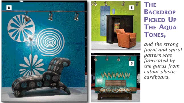
Traffic was arrested by Huppe’s striking armchair in vibrant flower power design (#8). The backdrop picked up the aqua tones, and the strong floral and spiral pattern was fabricated by the gurus from cutout plastic cardboard. And a similar flower concept is reproduced in the crystal lamp.
Trica’s informal dining set (vignette 9) again picks up floral impact in the upholstered chairs, more gold (“very important this season!”), brown tones and Aruba blue. And more French party plates forming the background design, connected with matching blue cord screwed to the wall.
Darker colours brought a different mood to the next “gallery” vignette (#10). The Italdivani sofa was in an oatmeal fabric, wood at the base, and the lampshade is an excellent match. The partners again sketched the arresting architectural design first, but “remained flexible to change and adjustments on the spot”. They used the chrome plastic strips again to good effect.
Cool and clean Canadel table and chairs, black and white, sported well-shaped chairs in refreshingly different styles (#11). Vases are also black and white, and the huge black background square is centered by a square mirror that reflects “other interesting elements in the store”.
Romano chairs (#12) are backed by an enormous Ikea print of the Tour Eiffel, a real statement... “and very inexpensive!” It’s mounted on snow cone green again, “striking and trendy”. The beigey-white swivel chairs are covered in architectural prints, a reflection of the metalwork of the Tour, a series of oval shapes overlapping. And the lamp is unusual. “There’s a chandelier within,” said Pierre, “and the textile mesh lampshade is transparent, it shows the interior crystal through it.”
The paint on the next backdrop is called “chocolate fondue” and sets off the low chrome-legged blue-teal sofa and chair (#13).
The designers reverted to glass and fabric-covered Christmas decorations (“some in our collection are years old!”) some on the table and in the crystal bowl, and some within half-circle plastic balls mounted on the wall. The lamp “is a sculpture really”, chrome with glass balls.
European styling is evident in the shaping, graining and finish of the Durham bedroom set shown in vignette #14. The rose leaf/botanical flavour of the beige, velour textured duvet and pillow coverings, are echoed on the backdrop. “Birds, trees, a salute to the environment.” The white ceramic birds and candlesticks (sans candles!) are used as sculptural pieces on the headboard’s shelves.
“Don’t hesitate to buy things that jump out at you anywhere. Anything that speaks to you and has style and is unique. Borrow things too, whenever you can. And let your imagination and inspiration guide you. Be edgy!”
One of the ways to get that “competitive edge! Note: The beautiful linens are by Maison du Beau, Lamps and chandeliers used in several of the vignettes are from Gen-Lite and enlivening paints by Benjamin Moore were used throughout the “gallery”.