In the October/November issue of FURNITURE WORLD, we talked about uncovering your retail store’s identity, or DNA – that is, what makes it unique. In December/ anuary, the second installment in this series discussed brand positioning, branding research, brand voice and brand promise. These are issues that you, as a furniture retailer, should consider if you want to keep your brand messages clear and on target. Both of these articles are posted to the article archives on www.furninfo.com.
At the most basic level, if your customer can’t readily find what she’s looking for — whether it’s the physical location of the store, the entrance to the parking lot, the leather upholstery section or, yes, even the restrooms — she won’t feel that her needs are being met. Then she’ll search elsewhere for a more user-friendly retailer.
In this issue, we’ll take a look at how to avoid this situation by using one of the most powerful tools you have at your disposal – external and in-store signage.
Signage and graphics can enhance your customer’s shopping experience and work together to reinforce your unique brand message. You can use these tools to make an emotional connection with your customers, and to create a positive shopping experience that keeps them returning to your store.
Customers can readily tell the difference between a store that has been planned to enhance their furniture shopping experience and one designed for other aesthetic or merchandising reasons. Even if she isn’t able to articulate this difference, she’ll just tell her friends that she “liked” shopping in one store more than another.
As your store grows in size and scale, it becomes even more important to periodically re-evaluate signage and graphics. Large scale retail venues can create an atmosphere where customers cease to feel at home, and here especially, words and other visual cues are critical to helping them to stay connected.
EXTERIOR SIGNAGE AND COMMUNICATION
You customer’s first impressions of your retail brand usually starts forming before she enters your building -- perhaps even before she leaves home. A direct mail piece, for example, will convey volumes. In addition to convincing her that she needs to visit your store, it should support subsequent branding messages she will encounter as she approaches and walks in your front door.
Once she sees your exterior sign, she knows she’s arrived at her destination. This should feel like a Eureka! moment for her, that is, if you have consistently expressed your brand identity in your advertising, direct marketing and exterior signage.
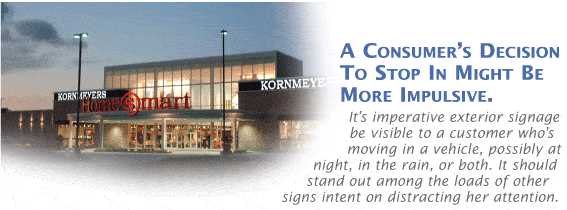
Alternately, a consumer’s decision to stop in might be more impulsive. It’s imperative that exterior signage be visible to a customer who is moving in a vehicle, possibly at night, in the rain, or both. It should stand out among the loads of other signs intent on distracting her attention. For most locations, this translates to a 60 to 80-foot high sign that can boast a host of graphic clues about your position on product selection, pricing, design services, etc.
A note of caution: this is not as simple as blowing up your logo. What works beautifully on a business card or letterhead may not translate well to a giant, illuminated billboard. First and foremost, your sign should be high contrast to be most visible. White at night and black during the day will give you the highest amount of contrast, but color background and typography are just as important. If you want your outdoor signs to be read from a busy highway, you need to deal with the parallax problem; that is, spacing between letters must be much wider in order for the sign to be read both from a distance and in motion.
The height and scale of your sign, the color, and the potential for shape recognition should all be considered. Take, for example, the silhouette of the Fairfield Inn sign, which incorporates a roof shape and is easily recognizable even from a distance where the letters may not be readable. And think about the ultimate marketing success story – McDonald’s – and how many times you encounter those famous golden arches before exiting the drive-thru. Is your store’s exterior signage equally effective?
REINFORCING BRAND IDENTITY OUTSIDE THE STORE
Your logo on a highly visible pylon sign is one of your first customer communication opportunities, but you should consider additional opportunities to communicate vital information before she ever enters your store.
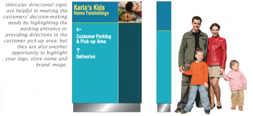
Vehicular directional signs are helpful in meeting the customers’ decision-making needs by highlighting the parking entrance or providing directions to the customer pick-up area, but they are also another opportunity to display your logo, store name and brand image. Signage for parking and pick-up areas relate information to customers, but they can also sear your brand identity into their minds.
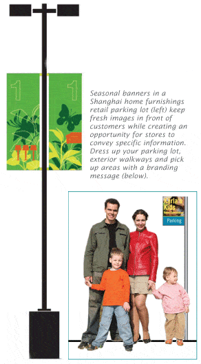
Is your parking lot just a parking lot? If so, you have an opportunity to dress up all that open concrete space. Celebrate the seasons with colorful lamppost banners, and use that blank canvas to tell them that exciting events are happening inside the store, If you are having a 4th of July sale or a store anniversary, tell them. Give them a taste of what is yet to come, inside.
Your sales associates may be well versed in working with your customers, but you should also consider posting informational content such as hours of operation and delivery hours outside your store at the points of decision making. Your customer will appreciate the time you save her by offering her this information before she gets out of her car.
FIRST IMPRESSIONS
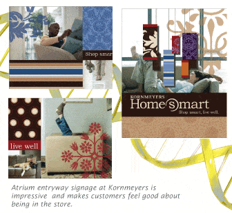
While it is important to hone your exterior communications to create a focused and positive first impression, the message she will get when she first enters your store runs a close second. The atrium or entryway to your store must be impressive, and should make customers feel good about being in your store. Consumers tend to orient themselves as soon as they enter the retail environment. All sorts of information about store size, layout, ease of entry and egress are communicated in just a few seconds.
The foyer or atrium provides you with a unique opportunity to begin to expand your branding message. It is at that point of contact where you can tell customers about your store and your unique message. Use environmental graphics to help set the tone. These should be strategically placed near the entryway because it is the beginning of your story -- the story of your brand. For Barnes & Noble, we created a mural 100-feet long and six-feet high that wraps around the atrium and features prominent 20th century authors. There is an entire story that’s told with this mural; it conveys a sense of purpose that only a bookstore can have, and it speaks directly to the value system of its customers. Similarly, you can use the entrance or customer service area to communicate information about your values that support customer notions of hearth and home, special events taking place, your products, departments, customers, unique and helpful services, history or whatever defines the essence of your store brand. A bank of monitors or TV screens, can help you to create eye-catching timely messages that support your brand message in an engaging and informative way.
Technology-driven signage, also known as dynamic signage, can cycle several different promotional pieces, and easily give your customers a sense of who you are, what you stand for — and set the tone for the experience to come.
A thoughtful mix of ambient and focal lighting in the entrance to your store and the atrium is absolutely critical to attract attention and make the store look open and ready to do business. Murals, oversized graphics three to four stories tall, and airy translucent glass are examples of how to make an entryway or atrium welcoming and intriguing. Take advantage of height to create a sense of lightness and well-being; use your second floor to create a dramatic open entryway that feels clean and spacious — probably two qualities she’d like her own home to have.
COMMUNICATING INSIDE THE STORE
Before you make any changes, take a walk through your store; viewing it as if you are a customer experiencing it for the first time. If you need some guidance about conducting a walk-through, check out Larry Mullins’ excellent article from the May/June 2006 issue of FURNITURE WORLD Magazine (posted to www.furninfo.com). A portion of his article deals with the “five-sensing” technique. You may know the store layout like the back of your hand, but your customer doesn’t. Look at things from her perspective, and you may be surprised at the things you take for granted.
Once inside, your customer should feel an immediate connection to the store. She should be able to sense what’s ahead and intuit what your store stands for, but she should also be able to find the mattress department if that’s what she’s after.
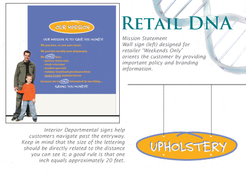
Once inside the entryway, customers should be able to see where they are going. Clearly marked departmental signage can help them find their way. So can architectural clues, such as paths or mock entrances. A visible department sign can eliminate the need for additional wayfinding signage. Keep in mind that the size of the lettering should be directly related to the distance you can see it; a good rule is that one inch equals approximately 20 feet.
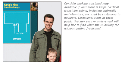
Consider making a printed map available if your store is large. Vertical transition points, including stairwells and elevators, are used by customers to navigate. Directional signs at these points that are easy to understand will help her to find what she is looking for without getting frustrated. People prefer to make decisions as they go, so directional signs usually work better than printed materials. Informative, appropriately placed, highly visible signs can help customers to find the bedding department more easily than having them ask an associate, or read a map.
Environmental signs can and should be continued throughout the store, using oversized graphics and pictures to provide your customers with an emotional connection to your displays. Consumers are increasingly interested in buying into a mindset or lifestyle rather than just buying merchandise, so anything that promotes values or otherwise connects with the consumer will help drive sales. You can have fun with this. Think about how fashion-forward apparel retailers make the most of store mannequins. Don’t be afraid to express your store’s unique personality in creative ways. It’s your DNA, after all.
Don’t neglect to use signage to communicate the services you offer. If you have a design center, by all means promote it. If your sleep shop takes old mattresses away when they deliver, let your customer know that, too. If you offer an on-site play area for kids, point out where it is. If you offer financial promotions, make sure your customer gets the details. Some of these things can be featured in printed takeaway pieces; sometimes 22” x 28” posters positioned in stands or easels at eye level is the best method. Tear-off point of sale sheets are particularly helpful for the “be-back” customer who never sees a sales person. You can also provide take home information on coordinating pieces and decorating ideas that can be supplemented with information available on your website.
CONCLUSION
If you’ve visited lots of independent home furnishings stores, you’ve probably noticed that few of them have taken the time to think about and implement a coordinated and comprehensive approach to store signage. That’s a shame, because simple, clear communication at every opportunity is vital to effective store branding.
External and internal signage can help you to create a store that is consumer-friendly, looks unique and offers an enhanced shopping experience. You want your customers to come away from your store energized and with a clear idea of the exact nature of your brand’s DNA and a positive, uplifted feeling. That feeling is often what makes customers decide to shop one place rather than another.
You can give her a sense of well-being even before she enters your store. Then follow up with a store atmosphere that really speaks to her set of core values. Finally, top it off with a well-thought-out, easy to negotiate store layout that gives her the information before she gets frustrated or needs to ask for it.
Martin Roberts is an internationally acclaimed design industry veteran, with over 40 years of credits for retail and product design. His most respected work is included in the permanent collection of the Museum of Modern Art in New York.
Throughout his career, Roberts’ has placed special emphasis on the role of branding and marketing in his work. In 1991, Roberts’ launched GRID2 International, a specialized design firm that incorporates scientific methodology to inform the design process. The company’s philosophy is based upon the belief that brands rely on making consumer connections, both emotional and rational, to support retail growth and prosperity. Retail science involves understanding those connections and why consumers buy specific brands.
Roberts’ previous works included such nationally and internationally renowned corporations and brands as Bank of Boston, Barnes & Noble, Cartier, Chase Manhattan Bank, Coach, Duty-Free Shops, General Foods, Johnson & Johnson, K-Mart, Marriott International, Nestle, Perrier, Samsonite, Thomasville Furniture, Timberland, and Wal-Mart.
Before founding GRID2, Roberts’ professional affiliations included membership in The Royal Society of Arts (London), the Society of Industrial Designers, and the Institute of Store Planners. With a BA in Industrial Design Engineering and an MA in Design Systems, Roberts has also served as an adjunct professor of Design Management at Parsons School of Design.
Questions on any aspect of retail branding or store design may be directed to him at mroberts@furninfo.com.